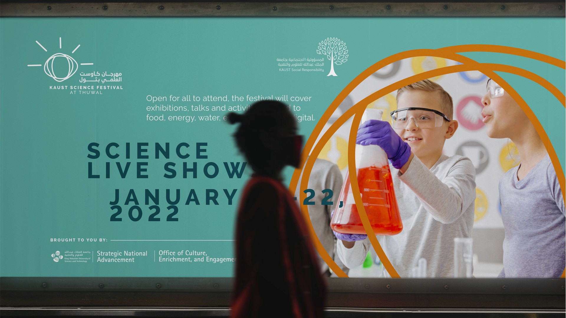
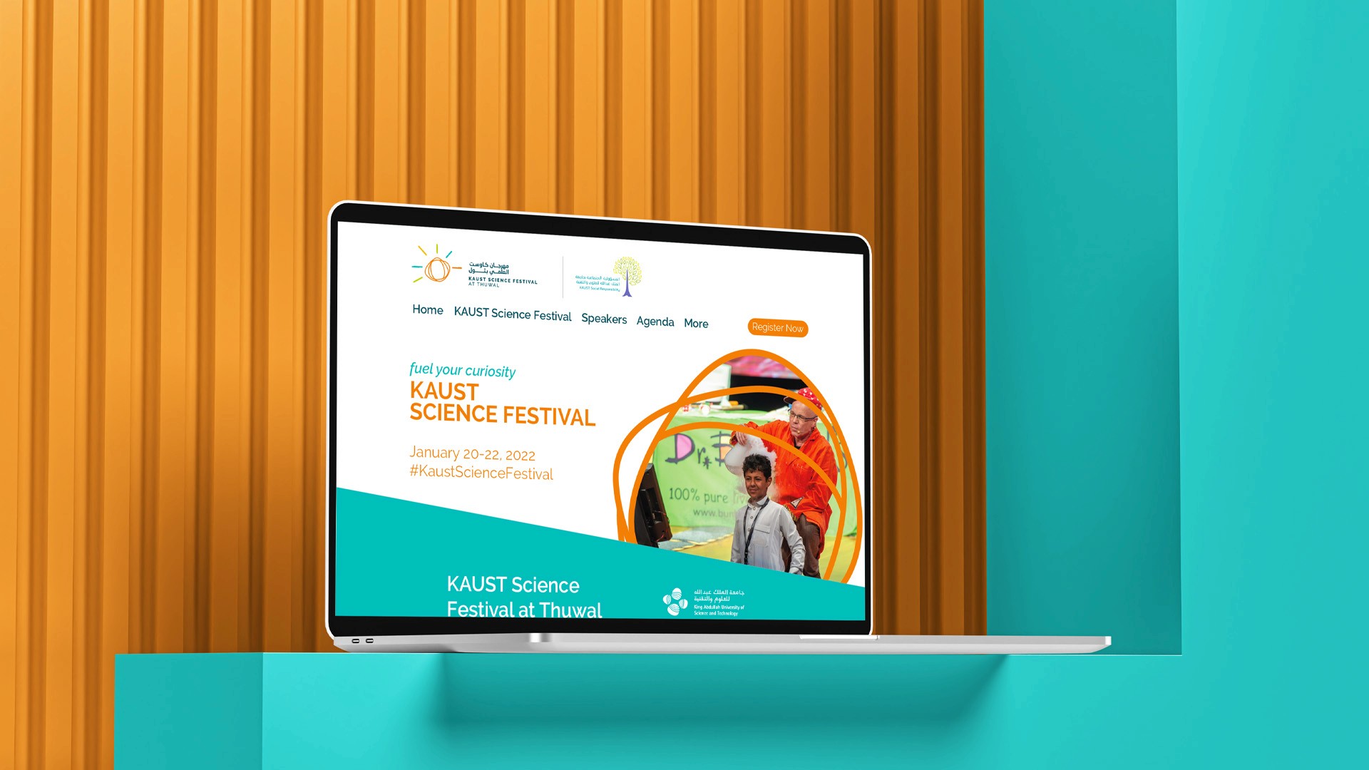
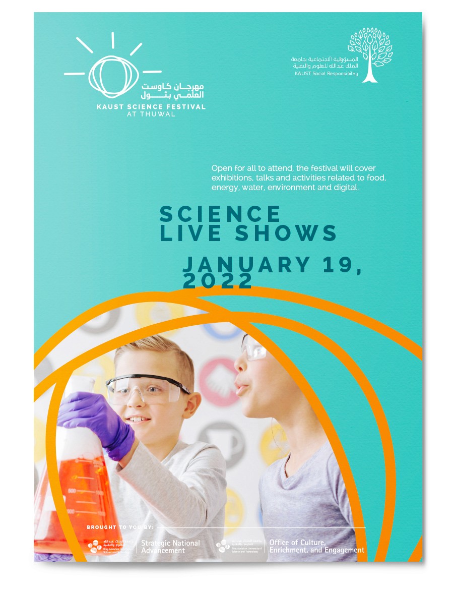
KAUST Science Festival
Services
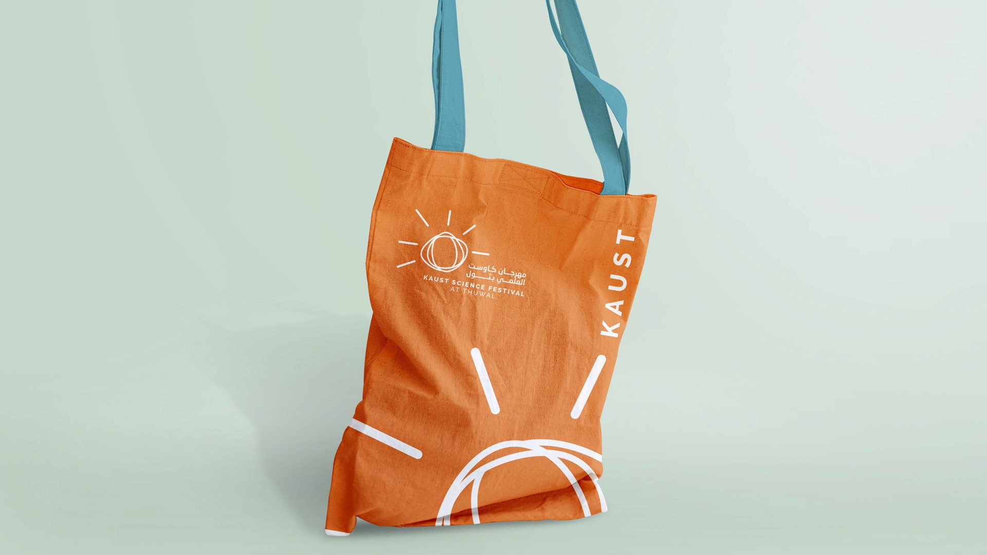
Brand Identity, Visuial Communication
Client
KAUST
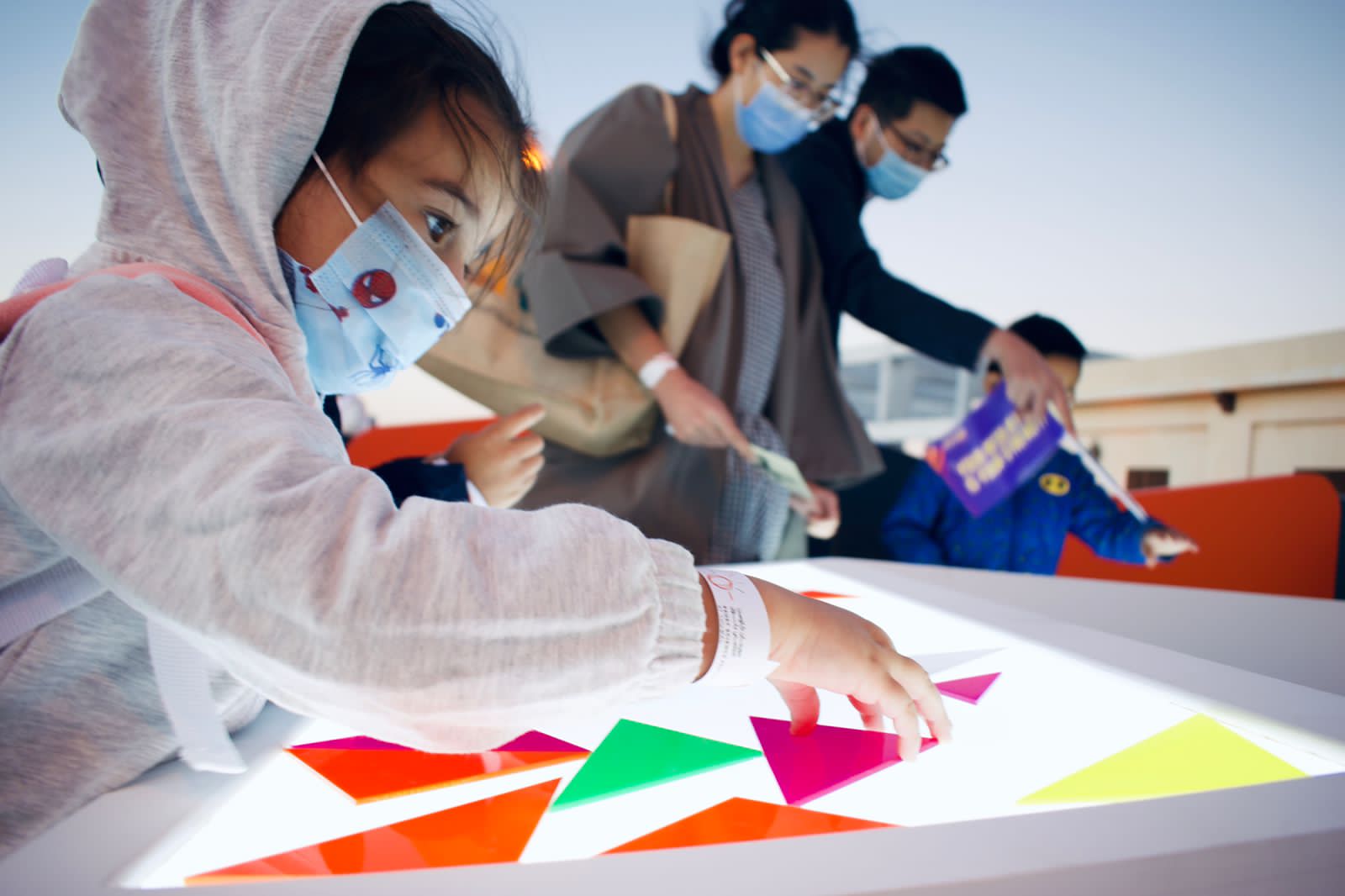
The KAUST Science Festival was designed to spark curiosity and celebrate discovery—bringing together people of all ages for three days of hands-on science, inspiring talks, and immersive experiences.
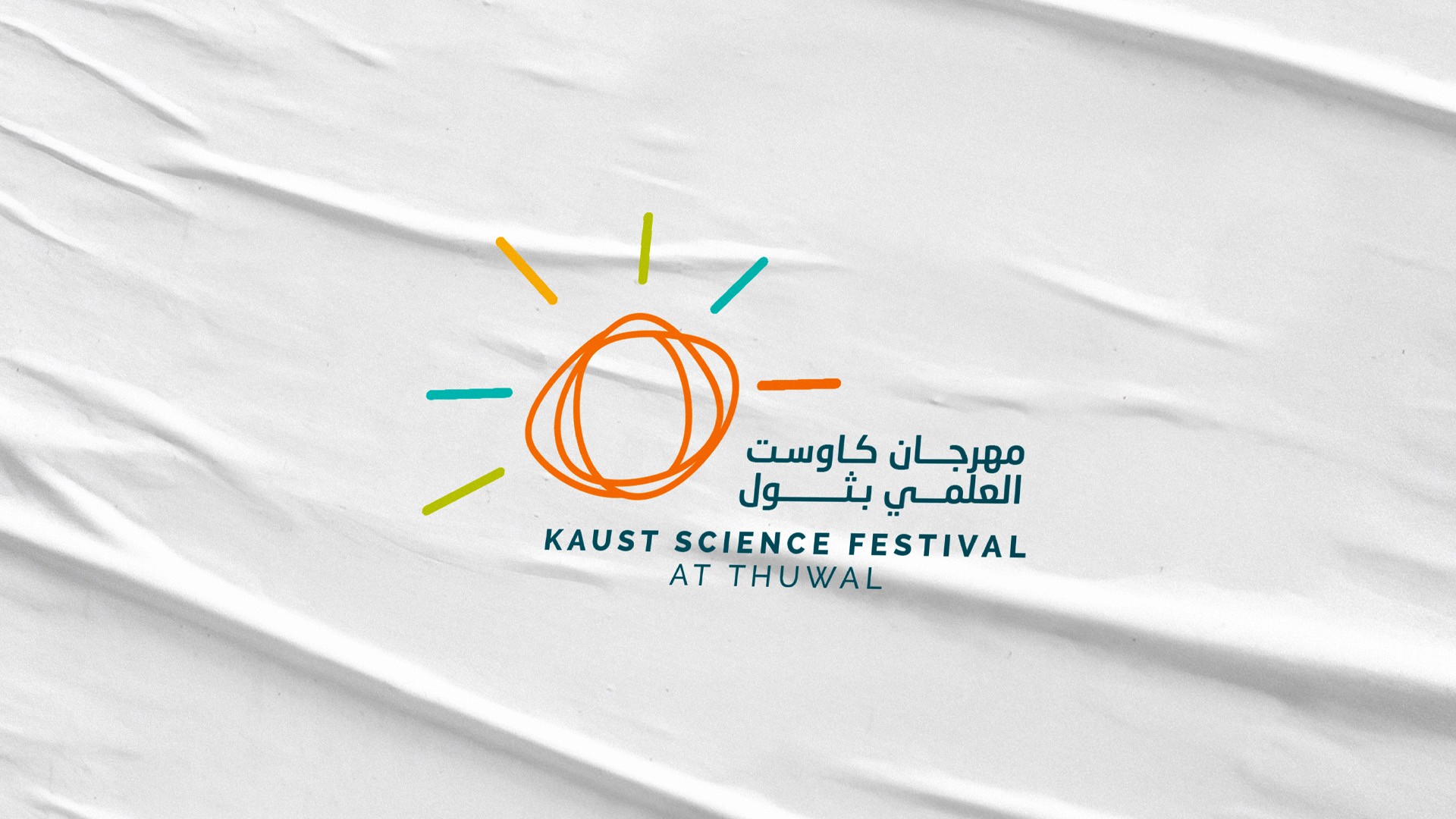
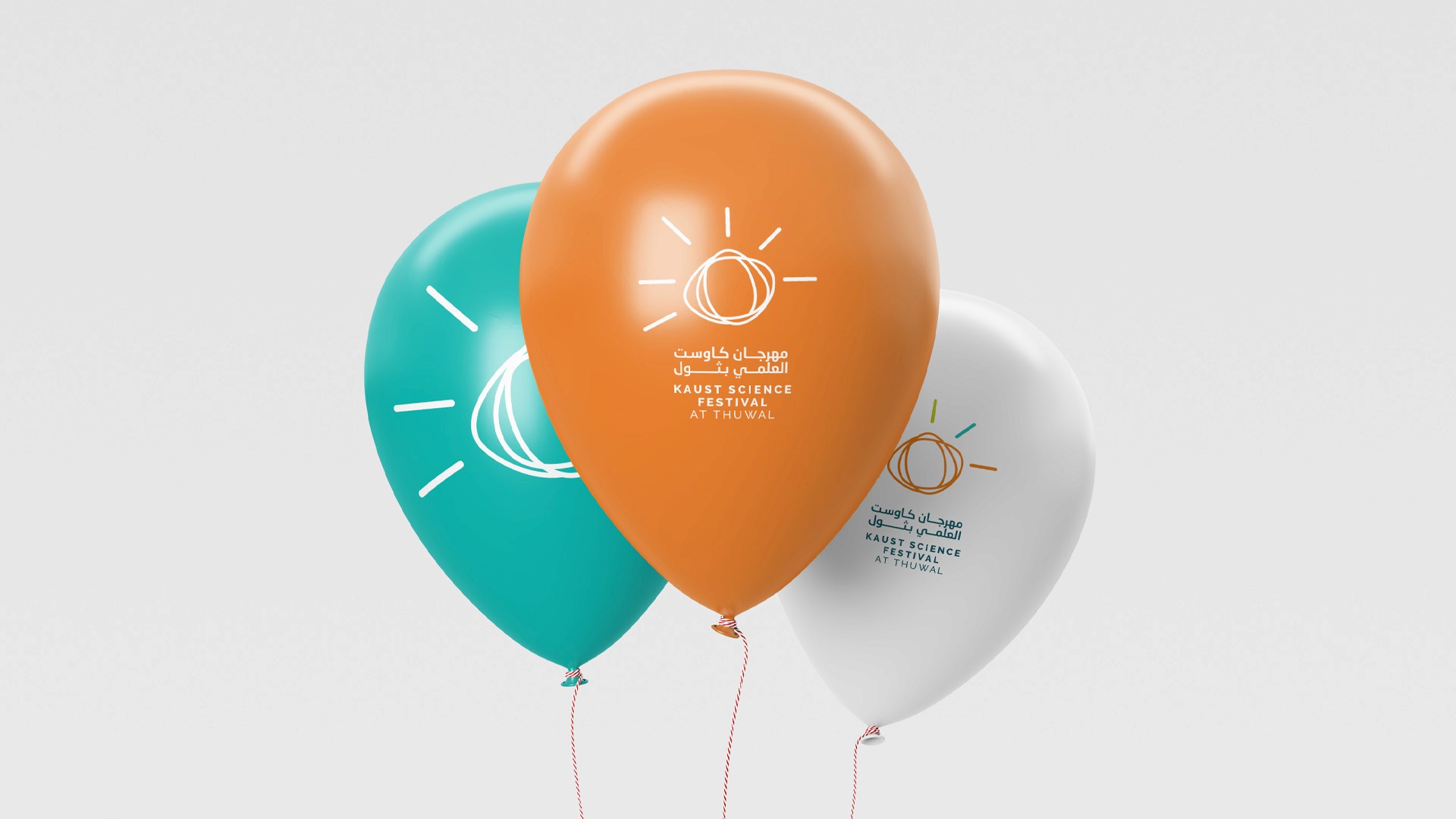
We created a logo inspired by KAUST’s iconic seeds, with each seed symbolizing a unique path of exploration. The radiating lines represent the sparks of innovation that emerge when science becomes accessible, exciting, and personal.
The key shift was treating the identity like a map of potential. By visualizing growth and movement, we captured the festival’s spirit—vibrant, open, and full of wonder.